Ariko reserv
project overview
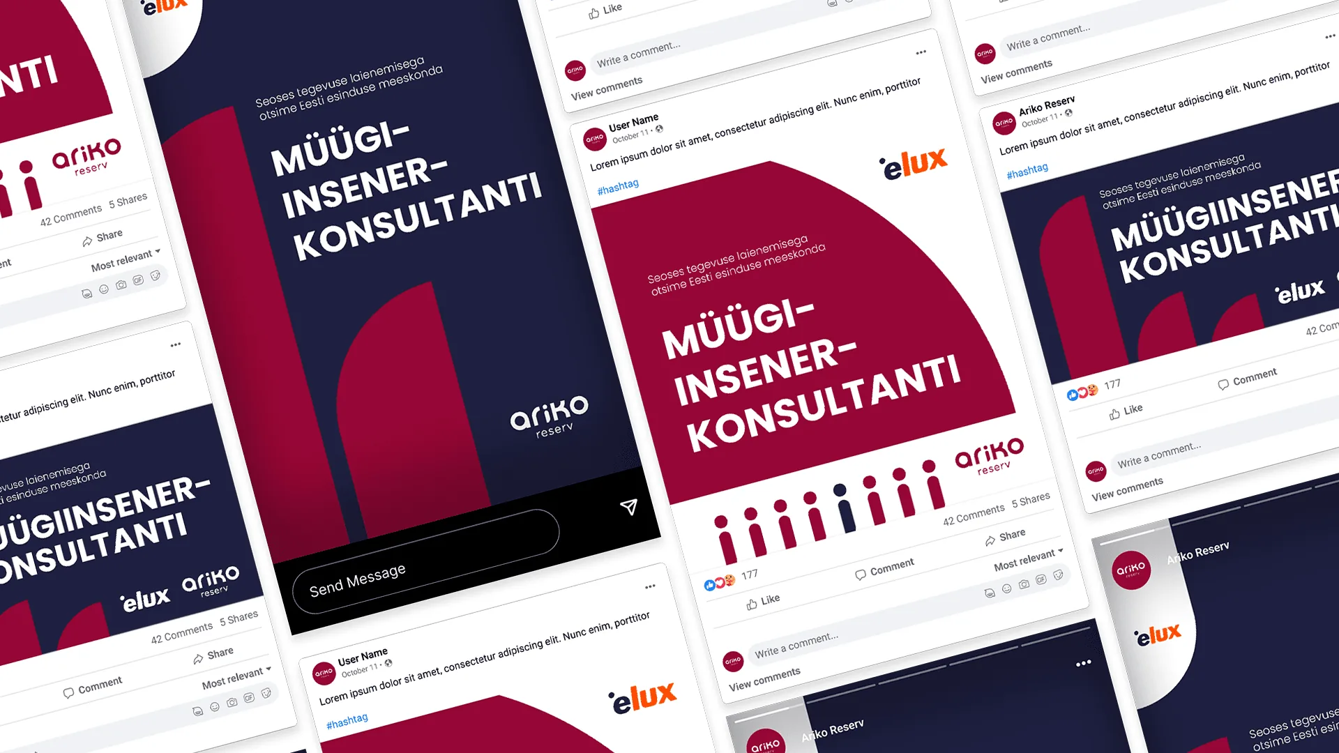
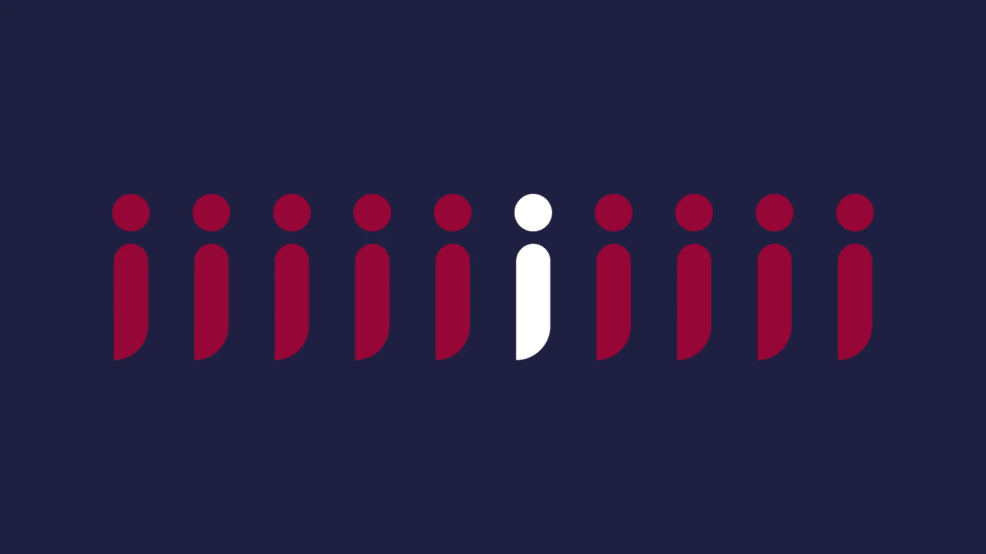
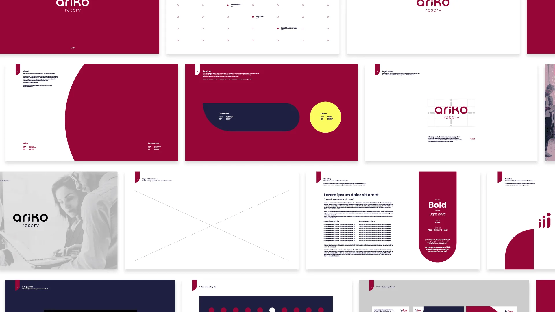
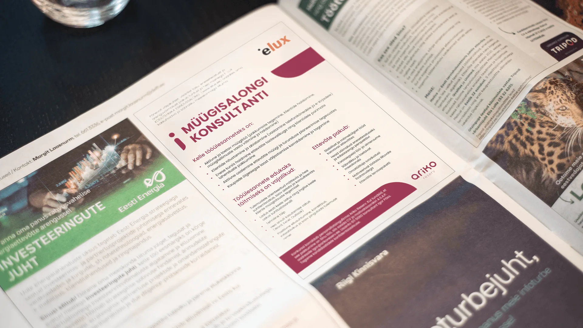
The brand and website required a full refresh. A new logo and visual language were created for Ariko, retaining only the original deep red as a link to its heritage. The palette was expanded with a dark blue to introduce a sense of trust and stability, and a vibrant yellow to add warmth and a subtle sense of innovation. A key graphic element was developed from the letter “i,” abstracted into a dynamic, human-like form. It functions as a flexible visual tool—used to create patterns, compositions, and simple illustrative metaphors across the identity.